Retro Faded Look

Photoshop Tutorial

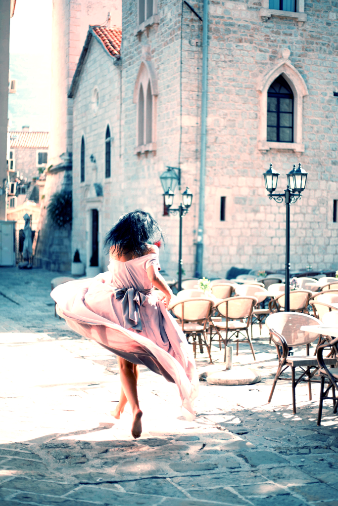
I did some research on retro effects. Many of my tests involved a stack of multiple Adjustment Layers. After an intesive trail-and-error experiment day I found an easier way to give a Photo a Retro feel. This effect is made with just one Adjustment Layer. I’ve included the near end of my search for an easier way with two Adjustment Layers.

One Layer: Curves.

The Curves Adjustment Layer is a great way to give a Photo a certain look.

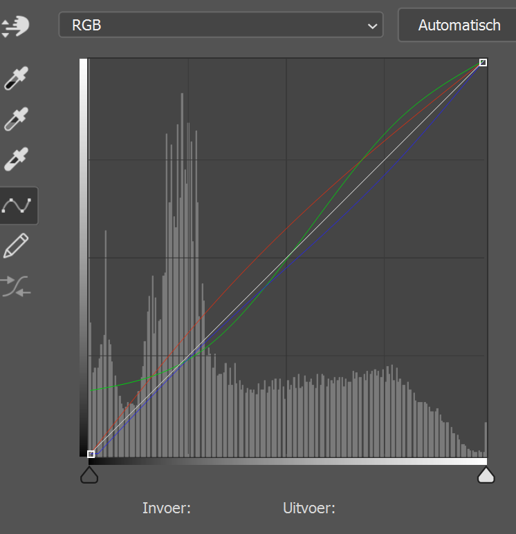
An easy way to describe the retro feel is that the blacks are brighter and the whites darker. This gives the faded low contrast.

To do this with the curve is to bring the black upwards and the white downwards.

The Middle stays were it is: the Midtones remain.

The Two other handles are moved to bring a bit more contrast back. If we would move the handles toward a flat line, it would give the Photo a more flat look.

After these changes in the RGB-Curve, the Photo looks quite good.

But we’re going to change the Color-Curves too. These changes are up to you and the Photo you choose to change.

The Blue-Curve: To give the Blacks and Shadows a Blue feel we move these handles upward.

To give the Highlights a more warmer feel we move this handle downwards. This adds the opposite color from Blue, which is Yellow.

Again, the Photo looks quite good. So the next change is up to you.

The Red-Curve: this adds a Magenta tone.

You can even change the Green-Curve. As I did in the example under this article.

Two Layers: Hue/Saturation Adjustment Layer.

So now we’re going to shift the colors. For example the reds toward orange, etc.

We do this with the Hue/Saturation Adjustment Layer. But do this with caution so we protect skin tones.

Gallery.

With the Green-Curve changed slightly.

Quick Photo Effect: Cool Action

Photoshop Tutorial

Every Step is a different Adjustment Layer. You can create every step in an Action or you can keep the Adjustment Layers in a map and replace the photo everytime you want to apply the effect on a different photo.

Step 1: Levels:

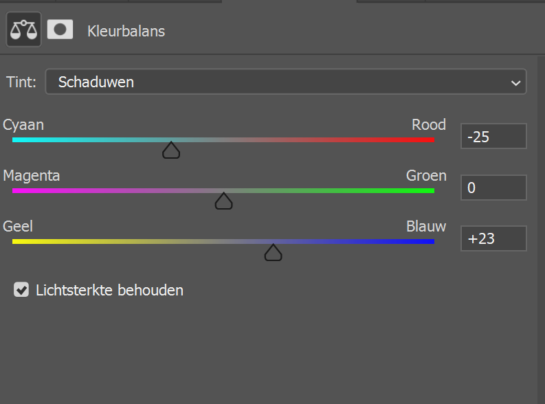
Step 2: Color Balance:

For the Shadows:

For the Highlights:

Step 3: Color Fill:

Fill this Adjustment Layer with a Bright Blue (#2284dc) and set the Blend Mode to Soft Light and the opacity around 80%.

Quick Effect: Western Mood

Photoshop Tutorial

Today’s Quick Effect is Western Mood. Every step is a different Adjustment Layers.

Step 1: Gradient Map. With colors: #453910 (deep amber) -> #dbf9ff (very pale cyan).

Step 2: Levels:

Step 3: Curves:

Step 4: New Layer.

Fill the layer with a Light Gray (like #c2c2c2). Then apply the Add Noise filter with 20%, gaussian and monochromatic.

Then add a Gradient Overlay in the Layerstyle: Blend Mode is Color Burn, Opacity: around 30%, Gradient Black-White, Angle is 90°, Scale is 150% (max.).

Set the Blend Mode to Divide and opacity around 30%.

Creating Effects with Clipping Masks

Photoshop Tutorial

Today I’ll show you how to create different Effects with Clipping Masks. With a Clipping Mask, your photo remains intact. When you’re done you can save the Photoshop File with the first photo as a Smart Object. You can replace the Smart Object with another photo to apply the effect on different photos.

Step 1: Choose your texture.

This Effect is all about textures. You can choose a texture or you can create your own texture. The texture I’ll e using is one I created in Photoshop with an Inkbrush.

The texture has different areas of opacity: the middle-left side has more opacity because that is were we’ll place the subjec the photo.

Step 2: Place your Photo.

Now we’ll place our photo. For this tutorial I choose a photo of Inna Mikitas, an Ukrainian Model. Place the photo on top of the texture as a new layer. Go to the Layer menu and choose Create Clipping Mask.

You can stop here and use this kind of Photo is any product: in an album, a collage… The transparency of the background will make this blend on other Photos.

For example: when this photo was taken on your holiday, you can place another photo of that day as background above a solid white background. Change the opacity of the background to whatever works for your photo.

Further Building of Effect:

You can build further to create different Artistic Effects. I explain how I created the effect in the example at the beginning of this article.

A. Add a Light Effect. Set the Blend Mode of this Lightleak to Lighten. Add a Mask and paint away any unnecessary parts.

B. Add another Texture for creating a Clipping Mask. This time only cover the subject of the photo. Duplicate the original photo and place on top of the Texture. Create a Clipping Mask.

We’ll do this one more time.

Two Texture Layers.

C. Add an Old Paper Texture. Or another texture with color or grain, scratches… Set the Blend Mode to Lighten and the opacity around 60%.

I’ve created a Mask for this texture and painted with a brush (50% opacity) on the subject of the photo. I wanted the effect on the model less then in the background.

And we’re done for now. I’ll build other effects with Clipping Masks in later posts.

Retro Text Effect

Illustrator Tutorial

Today I’ll show you how to create an easy retro text effect in Illustrator.

Step 1: Type the word.

This effect basically works with any font, but a sans-serif works better. The font I used is Blackcurrant Squash (by Rian Hughes).

  • Give the text a stroke and no fill.
  • Make the color white.

Step 2: Building the effect.

  1. Go to the Appearance panel (Window > Appearance):
    • Add 4 new strokes
    • Move the fill to the middle
    • Give the top stroke a white color and set the weight to 10 pt.
  2. Second Stroke:
    • Weight 10 pt. and color 20 or 30% grey.
    • Add an effect: Transform: Move horizontal and vertical: 1px. / copies: 50.
  3. Make the fill visible and the color is white.
  4. Third Stroke:
    • Give it a 10 pt. weight and a different color.
    • Apply the Transform effect but this time set the copies to 70.undefined
  5. Last Stroke:
    • Color for this stroke is black. This will be the shadow.
    • Apply the Transform effect but this time set the copies to 120.
    • Set the opacity to around 25%. undefined
  6. Add a new fill:
    • Place the new fill above the white fill
    • Give it a pattern fill with strokes.
    • Set the opacity to around 12-15%. undefined

Simple Comic Book/Poster Effect

Photoshop Tutorial

This is an update of the First Simple Comic Book Effect (here). The update is that this effect gives the photo a more vintage poster look. We’ve worked with a comic book effect and with gradients in other tutorials, so I came with this after experimenting and trying some combinations. This effect creates soe interesting results.

Step 1: Effects on the Photo.

First thing to do is to make sure the Photo is a Smart Object. This is important for fine tuning the effect afterwards. After that go to:

  1. Filter -> Stylize -> Oil Paint. Set every setting to 10.
  2. Add a Brightness/Contrast Adjustment Layer: settings will be different for every photo.
  3. Add a Posterize Adjustment Layer: the setting will depent on your photo, try to keep the values between 5-10. Set the Blend Mode to Soft Light and opacity around 60%.

I find that the Brightness/Contrast Layer, in many cases, needs some work after the Posterize effect. Or with some photo’s I used the Brightness/Contrast Layer above the Posterize Layer

Posterize lever: 8. Brightness: -6/Contrast: 17.
Brightness: -13/Contrast: 9. Posterize level: 5.

Step 2: Experiment with Colors.

The give it a Poster feel we can add a Gradient. Experiment with different colors and blending modes. Like I did:

Blend Model: Soft Light
Blend Mode: Normal
Blend Mode: Normal
Blend Mode: Screen.

Step 3: Combine Effetcs.

Sometimes the Simple Comic Book Effect doesn’t give a clean result. This is mostly when the photo has a lot af detail, like in the facial area. Any imperfection shows on the effect. You can render the filters, but I found the combination of these two effects interesting.

  1. Save your Comic/Poster Effect photo and open it as a new document.
  2. Apply the Simple Comic Book Effect
  3. Add a gradient.
With gradient
No gradient.

Text Effect: Fantasy Movie

Photoshop Tutorial

Step 1: The text.

Almost any font will work with this text effect. But for the sake of the effect name choose a fantasy style font. The font I used is Witchic Blackletter (you can buy it from a font store). And I used my own name as text. For the k in my surname, I typed it with a capital K, because the font doesn’t have a good small k (and not a very good capital R by the way. So if you want to buy a font, check every glyph.

Step 2: Text Effect.

Now it is time to build the effect. For this we’ll need two copies of the text. Each copy will have a different set of Layer Styles.

Copy 1 Layer Styles:

Bevel & Emboss style.

The first Tthing to do is the Bevel & Emboss. The contour is showed in the photo left.

Second style of the first copy: Innes Shadow:

Next is: Color Overlay:

Last one: Pattern Overlay:

The pattern I used is a black-white photo of a damaged wall structure. You can use different textures, like paper, of anything grainy.

The last thing to do with this first copy is a Gaussian blur of 0,5 px.

Copy 2 Layer Styles:

Again go to Bevel & Emboss:

The contour needs a bit work (see photo right).

And we’ll also add a Gaussian blur of 0,5 px on this copy.

This is the effect.

What I did extra is:

Background:

  1. A background with clouds.
  2. Add a layer filled with solid black. Then go to Filter -> Render -> Lens flare. Set the Blend Mode to Screen.
Nice, but not good enough.

Extra Clouds:

  1. Paint some clouds on a New Layer in front of the text. This will give a sense of depth.

Flares:

  1. I also painted some flares in orange, yellow and white. Set the Blend Mode to Screen and the Opacity between 85 – 100%. I created 5 flares and placed them random on the text.

Adjustment Layers:

The Adjustment Layers I used on top of everything are:

  1. Color Balance
  2. Levels
  3. Again Color Balance
  4. Photo Filter

And done!

Quick and Easy Halftone Effect

Geen categorie

Today I’ll show you how to create a quick Halftone Effect in Photoshop. I found this effect after trying different ways to (re)create an effect that makes your photo looks like an old engraved picture or like a picture on money. This is the most easy way to create this effect. Even when this is a quick way, the possibilities are close to limitless.

Step 1: The Photo.

The first you’ll have to do is add a Black-White Adjustment Layer on top of the photo. The effect wil be created on a black-white photo.

Step 2: Halftone Layer.

Create a New Layer and fill with 50% Grey. Now make this layer into a Smart Object. A Smart Object lets us adjust the effect afterwards.

  • Now go to Filter => Filter Gallery: under the tab Sketch => Halftone Pattern. Set the values to: Size 2, Contrast 0. Pattern Type: Dot.
  • Under the same tab: Torn Edges. Set the values to: Image Balance 25, Smoothness 13, Contrast 1.

Set the Blend Mode of the Halftone Layer on Hard Mix and the Fill around 80%.

Step 3: Apply a Gradient Adjustment Layer.

Choose a gradient with different colors. Every photo will need a different gradient. Sometimes you’ll have to adjust the values of the halftone to fine tune the look with a gradient. Gradient in First photo: 924663 -> d5dbd3.

Step 4: Experiment.

The values in Step 2 are values that work with most pictures, but not with all. So you’ll have to play with the values in order to get the best result.

Gradient: 125e56 -> ffa0a0
Gradient: 30527d -> ffae2e
Torn Edges Balance: 23, Fill: 88% and the Gradient: 62174f -> ffca8b.
Gradient: 2d2c54 -> e8c9d5

Vector Swirling Circle

Geen categorie

In this Illustrator tutorial we’re going to create a swirling vector circle.

Step 1: Basic Shape.

This is the basic shape: to create it follow the next steps:

  • Create two circles: a large one and in the center a smaller one.
  • Copy the smaller one and align it to the left so that the left side touch the left side of the big circle.
  • Copy the left circle so that it touches the right side of the bigger circle.
  • Now copy the two circles and rotate them so that they stand horizontally.

Step 2: Shape Builder Tool.

The Shape Builder Tool lets you create any shape out of basic outlinings. First we need to turn off the stroke and fill. Press CTRL + Y to enter the Outline Mode.

Now select everything and hold the Shape Builder to select the shape you want.

Step 3: Adding more swirls.

Copy the new created shape 3 times and rotate it so you get this result:

Step 4: Giving Color.

Now we’re going to give color to the shape. Select the Live Paint Bucket (behind the Shape Builder), select a color and paint the segments in that color. Tap CTRL + y to exit the Outline Mode.

Now we have a complete solid color shape. We have to make every segment in a separate object. To do this select the shape and go to Object -> Expand. Then ungroup the object several times until every segment is a separate object.

Step 5: Gradient Color.

Select 1 object and give it a gradient fill. Then select everything and with the color picker select the gradient fill segment.

Now you can experiment with the gradient and its angle, different colors…